Steps for Designing in a New Commerical Office Building
Creative industries are often at the forefront of office design. Think Mad Men-esque advertising agencies in the 1950s, with rooms designed specifically for imbibing cocktails with prospective clients. Or the Silicon Valley offices of today, complete with volleyball courts and young employees sitting on beanbags with laptops and fancy headphones.
Despite such design innovations, however, creative office spaces may actually be hampering–not helping–their employees' creative abilities. As it turns out, scientific research proves that creativity is cultivated in the workplace through a complex combination of structure and fluidity.

From choosing the right decorative colors to having designated spaces of quiet, the recipe for maximum creativity is a blend of innovative and tried-and-true office design principles, and that balance looks differently than the open-office trend that's become a symbol of progressiveness and hipness in the work world.
Shut Your Trap
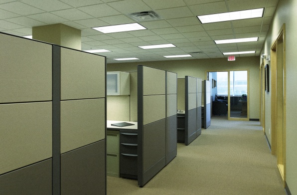
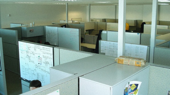
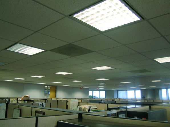
Perhaps the most pervasive office design trend of the last decade has been the "open office." Though this layout can give the impression of an innovative, go-with-the-flow company, studies show it can actually work against productivity and creativity.
Organizational psychologist Matthew Davis found that decreased levels of concentration and increased levels of stress are far more common in open layout offices than in standard ones. The feeling of psychological privacy that comes with individual offices also enhances job performance.
Not to mention what an open office layout does to noise levels. Studies have also shown that even a small amount of background noise increases mental workload, which further contributes to employee stress and lowered productivity.

The most effective office design for enhancing creativity while still encouraging productivity blends areas of collaboration and open idea exchange with supplementary areas of quiet where private, focused work can occur.
But creating designated spaces within the office doesn't have to be an eye sore.
"As designers, we don't just design the environment, we're designing experience and we're designing behavior," says Ginny Caldwell, director of interior design at Southeast Venture.
Office design should reflect the different work modes people experience on a daily basis, explains Caldwell. In addition to offering spaces where people can close the door and put their heads down to work, an office should allow for spontaneous work to happen anywhere.

Caldwell uses the modern break room as an example. No longer are they places behind closed doors. Instead, they take up the spaces that might have gone to the head honchos a decade ago, where there's an abundance of natural light and a killer view of the city skyline. The break rooms of today tend to have a bistro or café feel to them–a place where people would want to go to talk or collaborate.
"We're trying to create spaces where people do engage with each other in the workplace. By supporting that … it builds feelings of connection," Caldwell says.
And it goes without saying that more connected employees usually means happier, more creative employees.
Let There Be Light
In the same way that plants need the sun, so too is creativity dependent on natural light. Integrating sunlight into office design–and making sure it shines on all employees–is vital to creating the environments where creative ideas grow.
Round edges and circular design don't just put creatives subconsciously at ease, freeing up their minds to innovate. Curved edges also inspire spontaneous conversation, which can be a catalyst of creative thought. The U.S. Census Bureau kept this in mind when designing their new headquarters–instead of lining up desks lengthwise as was the case in their previous offices, the architects elected for curved edges in places with possible pedestrian traffic. A less rigid design allows for more organic movement among employees, encouraging run-ins that may not have happened otherwise.
Rohrschach Test
"How does that make you feel?" is a legitimate question to ask outside of the therapist's office. It should be asked continually when designing an office space because color, and even the smallest decorative objects, are factors in spurring creative thinking.
Psychologist Robert Epstein, a visiting scholar at the University of California, San Diego, says that surrounding people with unusual objects, or encouraging a visit to an art museum, helps encourage out-of-the-ordinary thoughts.
It's obvious to those in the marketing field that color choice is important for branding purposes, but it can also be a deciding factor in how effective a space will be in terms of fostering creative thought. Color selection is often seen as a subjective choice, but it turns out that colors and certain shapes actually elicit universal reactions from people.
Studies show that there are cultural associations with color that can send cues about how one should feel. The color blue, for example, is associated with water, which signals feelings of calmness. Red and black can suggest feelings of dominance and power, while yellows and oranges are more often associated with happiness and excitement.
Color, therefore, isn't just important for logos or branding. What color the office walls are, or what furniture accents the space, can all have subtle influences on employee moods.
Finally, beyond the psychological benefits to creativity and productivity, these design principles are also tools for generating new business and attracting high-quality talent. Creating an environment where it's clear that employees are serious about their work, but still open to collaboration, signals to potential clients–and potential talent–that yours is a company that thinks in innovative ways but still generates active results.
Steps for Designing in a New Commerical Office Building
Source: https://www.fastcompany.com/3036940/how-to-design-an-office-that-actually-makes-you-better-at-work
0 Response to "Steps for Designing in a New Commerical Office Building"
Post a Comment